COLOR MANAGEMENT: COLOR SPACES
A "color space" is a useful conceptual tool for understanding the color capabilities of a particular device or digital file. When trying to reproduce color on another device, color spaces can show whether you will be able to retain shadow/highlight detail, color saturation, and by how much either will be compromised.
THE DIGITAL COLOR PALETTE
Similar to how an artist might mix their primary colors on a palette in order to visualize the range of colors/shades they have to draw from, a color space is effectively just a digital palette — except these colors are much more precisely organized and quantified.

above palette photo is a modified version of the original by tibchris
However, unlike with an artist's palette, color spaces often remain unseen and serve only as backdrops for behind the scenes calculations. Even so, learning to visualize them can help you to identify the most suitable color space for a given task.
VISUALIZING COLOR SPACES
A color space relates numbers to actual colors, and is a three-dimensional object which contains all realizable color combinations. Similar to how one would organize a paint palette, each direction in "color space" often represents some aspect of color, such as lightness, saturation or hue (depending on the type of space).
The two diagrams below show the outer surface of a sample color space from two different viewing angles. This surface represents the most extreme colors which are reproducible within this particular color space (the "color gamut"). Everything inside the color space is therefore a more subtle combination of the colors shown on the surface.
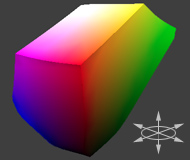 Sample Color Space
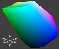 (Same Space Rotated 180°)
The above diagram is intended to help you qualitatively understand and visualize a color space, however it would not be very useful for real-world color management. This is because a color space almost always needs to be compared to another space.
COMPARING COLOR SPACES
In order to visualize more than one color space at a time, color spaces are often represented using two-dimensional slices from their full 3D shape. These are more useful for everyday purposes, because they allow you to quickly see the entire boundary of a given cross-section. Unless specified otherwise, two-dimensional diagrams usually show the cross-section containing all colors which are at 50% luminance (a horizontal slice at the vertical midpoint for the color space shown above).
2D Color Space Comparison
(Colors at 50% Luminance)
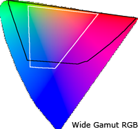
The diagram to the right compares three color spaces at once: sRGB, Wide Gamut RGB, and a device-independent reference space. sRGB and Wide Gamut RGB are two working spaces sometimes used for image editing.
What can we infer from a 2D color space comparison? Both the black and white outlines show the colors which are reproducible by each color space, as a subset of some reference space. Colors shown in the reference color space are only for qualitative visualization, as these depend on how your display device renders color. In addition, the reference space almost always contains more colors than can be shown on a computer display.
For this particular diagram, we see that the "Wide Gamut RGB" color space contains more extreme reds, purples, and greens, whereas the "sRGB" color space contains slightly more blues. Keep in mind that this analysis only applies for colors at 50% luminance, which is what occupies the midtones of an image histogram. If we were interested in the color gamut for the shadows or highlights, for example, we could instead look at a 2D cross-section of the color space at roughly 25% and 75% luminance, respectively.
TYPES: DEVICE DEPENDENT & WORKING SPACES
Color spaces have many different types and applications. Common terminology includes:
- Device-dependent spaces express color relative to some other reference space. These can tell you valuable information about the subset of colors which can be displayed using a particular monitor or printer, or can be captured using a particular digital camera or scanner.
- Device-independent spaces express color in absolute terms. These often serve as universal reference colors, so they're useful as a backdrop for comparing other devices. Otherwise these are usually an unseen color space, since they're knowingly interacted with during the photo editing process only rarely.
- Working spaces are used by image editing programs and file formats to constrain the range of colors to a standard palette. Two of the most commonly used working spaces in digital photography are Adobe RGB 1998 and sRGB IEC61966-2.1. For an in-depth comparison for each of these color spaces, please see sRGB vs. Adobe RGB 1998.
Devices or working spaces that can realize more extreme colors are said to have a "wide gamut," whereas the opposite is true for "narrow gamut" color spaces.
REFERENCE SPACES
What was the reference space that was shown in the earlier comparison? Nearly all color management software today uses a device-independent space defined by the Commission International de l' éclairage (CIE) in 1931. This space aims to describe all colors visible to the human eye based upon the average response from a set of people with no vision problems (termed a "standard colorimetric observer").
Note: Virtually all devices are subsets of the visible colors specified by the CIE (including your display device), and so any representation of this space on a monitor should be taken as qualitative and highly inaccurate.
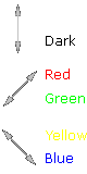
The CIE space of visible color is expressed in several common forms: CIE xyz (1931), CIE L*a*b*, and CIE L u'v' (1976). Each contains the same colors, but they distribute these colors differently:


(All color spaces shown are 2D cross-sections at 50% Luminance)
CIE xyz is based on a direct graph of the signals from each of the three types of color sensors in the human eye. These are also referred to as the X, Y and Z tristimulus functions (that were created in 1931). However, this representation allocates too much area to the greens — confining most of the apparent color variation to a small area.
CIE L u'v' was created to correct for the CIE xyz distortion by distributing colors roughly proportional to their perceived color difference. A region that is twice as large in u'v' will therefore also appear to have twice the color diversity — making it far more useful for visualizing and comparing different color spaces.
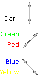
CIE L*a*b* remaps the visible colors so that they extend equally on two axes — conveniently filling a square. Each axis in the L*a*b* color space also represents an easily recognizable property of color, such as the red-green and blue-yellow shifts (used in the 3D visualization at the start of this tutorial). These traits make L*a*b* a useful color space for editing digital images, such as with Adobe Photoshop, GIMP, etc.
For further reading, please visit:
Part 1: Color Management: Overview
Part 3: Color Management: Color Space Conversion