SOFT PROOFING PHOTOS & PRINTS
Soft proofing lets you temporarily simulate how an image will appear on another device, such as a printer, by using only a computer monitor. This can be a helpful tool for making more predictable prints — and is perhaps one of the most useful applications of color management. However, it also requires a trained eye, in addition to knowing how to correct an image if it doesn't appear as intended.
 On-Screen Image
 Example Soft Proof
WHAT YOU'LL NEED BEFORE YOU START
Achieving an accurate soft-proof requires all of the following:
- A calibrated/profiled monitor. See the tutorial on monitor calibration.
- A printer profile. Ideally this should be a custom profile which has been specifically measured for your particular printer, ink, paper and driver settings. These are not provided with the printer and cost additional money (or can be measured yourself), but if you are serious about getting accurate prints they are a must. However, sometimes manufacturer-provided profiles can also be helpful — but only if you're using the same type of photographic paper and ink for which that profile was designed.
- Color-managed software. This tutorial uses Photoshop when applicable, but just about any program will offer at least some of the settings discussed. See the tutorial on color management for background reading.
Note: Strictly speaking, an accurate soft proof also requires a computer display that is capable of reproducing the full range of image colors as they will appear in the print. However, the requirements for this vary from image to image, and even if the monitor isn't fully capable in this respect, it can often still provide a helpful soft proof for those colors which it can produce (as long as one is also aware of those which it cannot). See the discussion at the end for more...
HOW IT WORKS
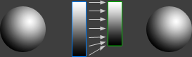
Soft proofing works in two conceptual stages. The first stage primarily simulates the out-of-gamut colors, whereas the second stage simulates dynamic range and white balance:
 Original Image
Stage 1

Stage 2
 Soft Proof
Above example uses a relative colorimetric rendering intent for stage 1.
However, from the computer's perspective, both stages are performed instantaneously, and neither actually changes the image data itself — just how it's displayed. Either stage is also optional, so one could choose to see the effects of each in isolation.
Stage 1: Color Space Conversion. This stage shows what happens when the image's color space is converted into the printer's color space — and is identical to how a color-managed image is converted when it is sent to the printer. Any out-of-gamut colors are therefore compressed into the printer's (typically) narrower color gamut.
Stage 2: Display Options. This stage isn't actually applied to a file when printed, and only aims to address how the image is displayed — such as compensating for differences between the brightest and darkest tones on your monitor and those in the print.
TYPICAL SOFT PROOFING SETTINGS
The window below is for Photoshop CS2-CS5+ (go to "View > Proof Setup > Custom..."), although earlier versions and other software will usually provide a similar set of options.
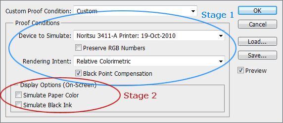
If you're not interested in the details of the above menu, an accurate soft proof can usually be attained by using the settings shown above (but make sure to select your own printer profile from within the "Device to Simulate" menu). Otherwise, see the explanations below to dig a little deeper.
Preserve RGB Numbers. You generally don't want to have this box checked, since it disables the color space conversion, and effectively shows what would happen if you sent your image color values straight to the printer without any color management. This is equivalent to assigning the printer profile to your image (and replacing the current one).
Rendering Intent. This simulates how colors will be compressed when they are converted into the printer color space, and is the single most influentual control over how image colors are printed. If this option isn't available, relative colorimetric is usually the default. For more, see the tutorial on color space conversion.


Black Point Compensation (BPC). This ensures that the monitor's black is equal to the printer's black, and is typically the default setting when printing. It should therefore almost always remain checked. Images printed with BPC retain slightly less contrast, but also avoid clipped shadow details.
| Black Point Compensation: | OFF | ON |
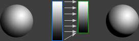
2D colors spaces shown above are the Display (left) and Printer (right).
note: above printer image has not been adjusted for dynamic range
Technical Notes. BPC ensures that an image's dark grey tones will transition smoothly into black when printed, similar to how a perceptual rendering intent compresses out of gamut colors instead of letting these become clipped. In fact, since the rendering intent applies to both colors and shades, BPC effectively overrides the shadow clipping that would otherwise result from a relative colorimetric conversion (since monitor black is usually much darker than printer black), but has no effect when a perceptual intent is selected. In other words, BPC makes it possible to independently choose between whether to clip out of gamut shadows and/or out of gamut colors.

Simulate Black Ink. This compresses the dynamic range of your on-screen image so that it more closely matches that of the print. It works by lightening the image's black until the dynamic range has been sufficiently reduced (with all other tones being shifted accordingly).

Simulate Paper Color. This setting converts the image's on-screen white to match the color temperature of white on paper (which is equivalent to an absolute colorimetric conversion). In addition, this also compresses the dynamic range of the on-screen image so that it matches the narrower range in the print (similar to the above "black ink" setting), but it does so by also decreasing the on-screen intensity of white. When paper color is checked, the black ink setting is therefore usually unavailable (since the on-screen dynamic range is already being compressed).
HOW TO INTERPRET A SOFT PROOF
When comparing the results of a soft proof with the previous on-screen image, the difference can vary wildly — from subtle to drastic — all depending on the combination of monitor, printer and image content. However, in practice not all apparent changes matter as much as one would think, so it's important to keep in mind the image aspects that our eyes will automatically compensate for (mostly stage 2), and those they won't (stage 1).
 Choose a Soft Proof Setting:
| Relative Colorimetric | Perceptual |
 Gamut Warning
(gray regions)
Note: Left image only shows soft proof when you have your mouse over one of the two settings.
Soft proof does not include the black ink or paper color settings (see image below).
The result is only qualitative since it depends on the color capabilities of your monitor and printer.
Stage 1: Color Space Conversion. Turn on the "Gamut Warning" feature in your software, if available (shift+ctrl+Y in Photoshop), since this will indicate which on-screen colors are outside the printer's color gamut. Pay careful attention to what happens to these out-of-gamut colors during the soft proof. Problematic colors often include the saturated mid-tone colors (especially the reds), since most printers cannot reproduce these as intensely as monitors.
A small reduction in color saturation is usually acceptable (and unavoidable), but changes in hue should be prevented whenever possible. If you see a change in hue (such as a reddish region becoming orangeish), then you may need to try a different rendering intent. Otherwise your only other option would be to tweak the original image colors in that region until you achieve an acceptable soft proof.
Once you've decided on your optimal stage 1 settings, it's important that you also use these when you print the image — otherwise the soft proof won't be representative. Unfortunately, it's necessary to soft proof each image separately for color-critical projects; some image colors and printer types might appear better with perceptual rendering intent, for example, whereas others might be better off with relative colorimetric.
Choose a Soft Proof Setting:
| Black Ink | Paper Color |
Above soft proof is relative colorimetric
with black point compensation applied.
Stage 2: Display Options. Even though the simulate "black ink" and "paper color" settings usually have the most immediate impact on the image, they're probably the least important. This is because our eyes automatically compensate for changes in white balance, and to a lesser extent, we also get used to seeing a narrower dynamic range on paper. This is why both of these settings are disabled by default, or aren't available in the first place.
Regardless, if either setting is used, it is critical that the resulting image be viewed in full-screen mode (without anything else on-screen, including even the menu bar or mouse cursor). It's also a good idea to look away briefly when enabling either option. That way your eyes won't have an on-screen or prior reference, and can fully adjust to the image as they would when viewing the print.
LIMITATIONS & COMPLICATIONS
At this point, you might be wondering: how can a monitor simulate the output of a printer if it isn't able to reproduce the full range of printer colors? Doesn't this lead to problems? Fortunately, the reason soft-proofing is even possible in the first place is because most monitors have wider color gamuts and a greater dynamic range than prints:
| Select: | Wide Gamut (High-End) Display | Narrow Gamut (Mainstream) Display |
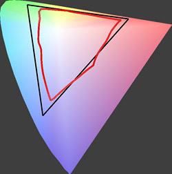 2D Comparison (Top View)
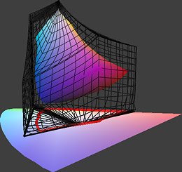 3D Comparison
Printer in above example: Costco Noritsu 3411 on glossy Fuji Crystal Archive paper.
Wide gamut monitor in above example: NEC LCD2690WUXi.
Narrow gamut monitor in above example: IBM T85D LCD display from 2001.
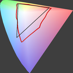
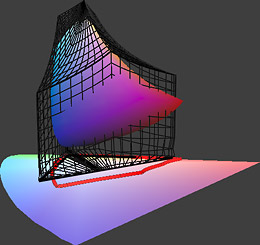
How to interpret the figures. The 2D plot lines (red and black) show the most saturated colors reproducible at any lightness, as a subset of the range of colors visible to our eyes (which is depicted by the colored wedge-shaped region in the background). The 3D plot shows the range of colors reproducible (horizontally) for each lightness level (vertically). The shaded 3D shape and black wire mesh represent the outer edges of each device's color space.
With the wide gamut monitor, note how the printer colors (in red) are nearly fully contained within the range of colors reproducible by the monitor (in black; wire mesh on right). The vast majority of out-of-gamut colors are therefore clipped by the printer, not the monitor. In this case, soft-proofing can work amazingly well.
Unfortunately, the above example is really a best case scenario, since the monitor was chosen because it has a relatively wide color gamut. In many other scenarios, the gamut of the printer can extend beyond that of the monitor — in which case it may be impossible to simulate all printer colors using the monitor. However, this also depends on whether the image itself contains these out of gamut colors, so soft proof accuracy will also vary greatly from image to image.
Fortunately (at least for the purposes of soft-proofing), all current printing technologies have less dynamic range than monitors under normal viewing conditions, so a monitor can always simulate this aspect of a printer. In addition, the simulate paper color and black ink settings typically aren't limited by the monitor's capabilities.
OTHER NOTES & FURTHER READING
Other important points and clarifications are listed below.
- How to Mimic the Soft Proof Feature. For software that doesn't have a soft proof feature, you can still identify out of gamut colors (and how they will appear) if you convert the image into the printer's color space (by selecting the printer color profile).
- Apparent Color Saturation. Ensuring that your image has a neutral white balance can make colors appear more saturated — even with a limited color gamut printer. Also keep in mind that our eyes are primarily sensitive to relative saturation — not absolute saturation. This means that a given color will appear more saturated if its surroundings are less saturated (even if that given color doesn't actually change in saturation itself).
- A Fundamental Limitation. Computer monitors work by transmitting image light, whereas prints work by reflecting ambient light. Unlike with prints, it may therefore be more difficult for our eyes to discount the white balance of the light source, since the image actually is the light source.
- Trial & Error. Don't expect accurate results right away. One may need to go through several iterations of soft proofing and printing before developing a visual intuition for how an on-screen soft proof translates into a print.
For similar topics, also visit the following tutorials:
- How to Calibrate Your Monitor Calibration for Photography
The quality of a soft proof will only be as accurate as the monitor that's being used. - Color Management, Part 1: Overview
Helpful for understanding what happens to color values along the imaging chain. - Color Management, Part 2: Color Spaces
Useful for visualizing and interpreting differences in device color. - Color Management, Part 3: Color Space Conversion
A visual comparison between the various rendering intent options of a soft proof.